Monetary regimes and economic outcomes
His data is taken from a 1993 paper by Michael Bordo and consequently doesn't cover information from the last two decades. ("I made you some charts. Because I love you that much. (But not enough to extend the floating exchange rate regime data down to the present; that’s actual work.)")
Well, that sounds like a challenge. And if anyone is fit to do mind-numbing compilation of data[*], that would be your typical economic graduate student...
Behold: I give you Rauchway's charts brought forward to the present day!
 |
| Fig. 1 |
 |
| Fig. 2 |
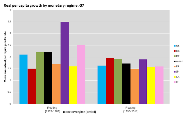
Compared to Rauchway's charts, the updated versions bring both good and bad changes from the perspective of floating (fiat) currency proponents. On the positive side, inflation has come down quite a bit. On the negative side, so has real GDP growth — although to a lesser extent. You can better see this by looking at the next two charts, which compare the 1974-1989 (i.e. as in Bordo's paper) and 1990-2011/12 periods of the post-Bretton Woods era.
 |
| Fig. 3 |
 |
| Fig. 4 |
Of course, this is more or less as one would have guessed. We know that late '70s and early '80s were a period of high inflation — with various shocks and loose monetary policy to blame. On the GDP side, it's interesting to note that Japan appears to be the primary driver of slower growth in the latter part of the post-Bretton Woods era (Fig. 3). Given that it's stalling economy is probably suffering from a lack of monetary accommodation to drag it out of liquidity trap conditions — Note: recent events may provide the decisive policy experiment to prove whether this is the case or not — it's far from obvious to me that the strictures imposed by the alternative monetary regimes would have yielded better outcomes. (I've had my say at various times on this blog as to why I think returning to a gold standard is a rotten idea, so I won't go into that now.)
And, on that note, I should say that I fully agree with the various commentators in the Crooked Timber thread, who have been pointing out that these don't charts don't nearly suffice i.t.o. counterfactuals, etc, etc. Still, these eyeball comparisons remain an intriguing bit of blogosphere fun.
___

Comments