Are charts of oil priced in gold really that impressive?
Following on from my last post, I've just clicked through to Chris's website and seen a post titled, Petrol Price in Gold Terms, in which he argues that the recent rise in South African petrol prices are "not owed to higher petrol prices, but a much weaker Rand, caused by the Reserve Bank". [I assume by petrol prices he obviously means oil prices.] He continues, "In hard currency terms, the price of petrol is unchanged since 2002."
Chris isn't alone in making this argument, which is a favourite among gold fans. That said, I've never found it as persuasive or profound as others seem to do. If you read my previous post then you may already have guessed why, but here is the key passage:
Looking at [gold] prices first, we can see that these have been undeniably impacted by the rising costs of producing an ounce of gold. This can be put down to a number of things, but chief on that list would be rising energy costs (since mines are incredibly energy consumptive)...
Energy is a fundamental input in mining activity. Gold mines, which are deeper and more complicated to run than virtually all other mining operations, are clearly no exception. In that light, why wouldn't we expect the price of gold to track what is happening in the oil market? It would be roughly analogous to me saying that cupcakes have stayed at a constant price... in terms of flour.
Now, if you're about to argue that what I've said would hold for coal but not oil... Fuggedaboutit. The movements of coal and oil movements track each other very closely. So much so that oil prices are widely used as a proxy for coal prices when forecasting and hedging in the electricity industry (since they are also more liquid). This is true even in countries where oil plays an insignificant role in power generation. And, of course, mining companies still consume vast quantities of oil during their day-to-day operations regardless of which energy source fuels their electricity needs.
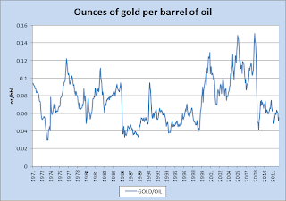
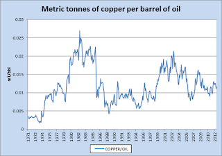
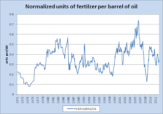
Anyway, to illustrate here is the price of gold per per barrel of oil since 1971, followed by the same for several commodities. These series were picked more or less at random and are taken from the World Bank's Data Centre. (Click to enlarge.)
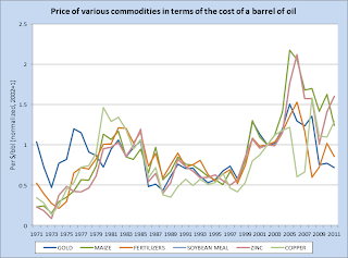
Not much to choose between them, if you ask me. The point here is that virtually all commodities exhibit some kind of long-term mean relationship with oil. Indeed the increasing linkage between energy and non-energy goods was a driving factor in the commodities boom of recent years. Now, of course, scale matters here and it might be misleading just to eyeball separate charts. As one last treat then, here is a single chart containing the above commodities plus a few extra, normalized in terms of their respective units. (I pick 2002 = 1 for no better reason than this is the year that Chris used in his initial post.) Again, I think the message is pretty clear.


Comments